Unless you work in marketing, odds are you're not really a fan of ads. However, that doesn't change the fact that if you consume media of any kind, you're being bombarded by ads all day. And while a lot of them are pretty typical, every now and then, an ad pops up that leaves an impression. Read on for some of our favorite advertisements past and present, that changed what people thought they knew about advertising!
Bearded Lady Bourbon's 'Stay Strong' Ad
Bearded Lady Bourbon's 'Stay Strong' Ad
Sometimes, to make a memorable ad, you have to get a little bold. That's what bourbon maker Bearded Lady did when they released their "Stay Strong" campaign. This image was only one part of the campaign, but it might just be one of the more memorable. It shows an airport security officer lubing up her fingers to get ready to check for any paraphernalia. However, the most disturbing part of this image might just be the look on her face.
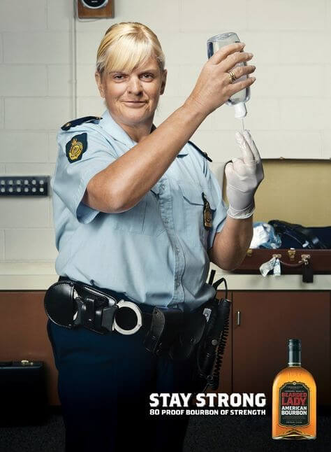
We imagine that having to go through something like this would be bad enough, but actually having it done by someone who seems like they're enjoying it would just be a nightmare. It's definitely something that sticks with you, which means it's great marketing.
This Porsche Ad About Small Cars
There are a couple of different ads on this list that were released by Porsche, and for a good reason. The company just keeps making incredibly funny ads using clever graphic designs. This one, released in 1967, admits that their cars are a bit too small to do anything but drive in. However, the second part of the ad pretty much acknowledges the reason a lot of people buy a car like a Porsche.
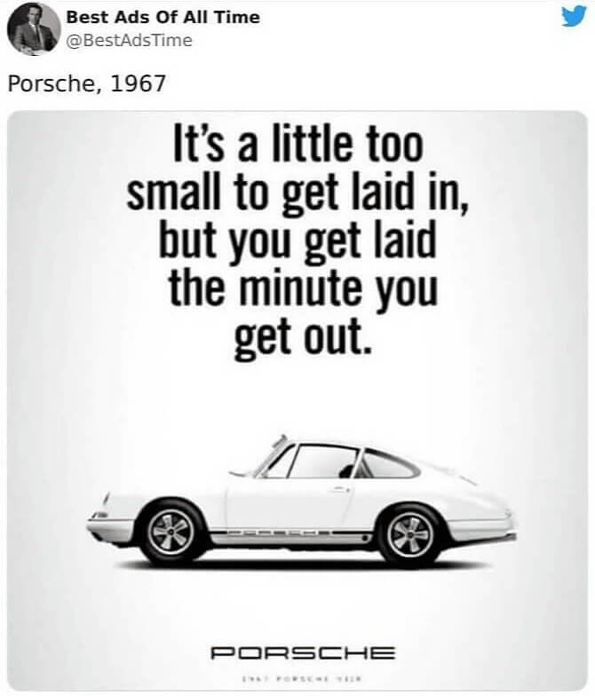
It's a pretty clever marketing move, and it's also a really spicy ad to have been released all the way back in 1967. It looks like something that could be released today. In fact, if they decided to bring this one back, it would probably do really well.
FedEx's 'Neighbors' Ads
It's a pretty clever marketing move, and it's also a really spicy ad to have been released all the way back in 1967. It looks like something that could be released today. In fact, if they decided to bring this one back, it would probably do really well.
FedEx's 'Neighbors' Ads
There are few names in delivery that are reliable or as fast as FedEx. Apparently, the company knows this because they released this ad around 2010. It shows two neighbors, with the neighbor on top handing a package to the person below him. It's supposed to represent how fast and efficient FedEx's services are. And if you look closely, you can see where the graphic designer placed a map of the Americas on the building's wall.
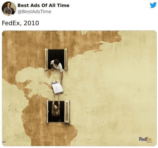
So, basically, the commercial is saying that shipping internationally is as easy and quick as handing a package to your neighbor, which seems like a simple statement, but it's done cleverly here. It's also worth mentioning that there were other versions of this ad that highlighted different continents, such as Asia.
Another Legendary Lego Ad
For whatever reason, Lego always releases memorable marketing ads and other forms of media. For example, all of their movies and games are always well-received. This ad is from 2018, and it kind of captures the essence of Lego pretty perfectly. It's just a simple assortment of Legos, but with shadows shaped like boats, tanks, airplanes, and dinosaurs. It's basically saying that you can build pretty much anything you can imagine with Legos.
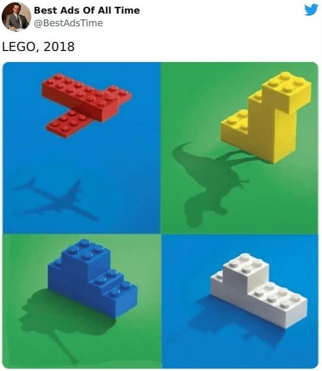
And while we're sure that the company actually has complex sets that allow you to build all of these, they only use a couple of simple blocks arranged to form silhouettes of the shadows.
Maybe The Best Dentistry Ad Of All Time?
And while we're sure that the company actually has complex sets that allow you to build all of these, they only use a couple of simple blocks arranged to form silhouettes of the shadows.
Maybe The Best Dentistry Ad Of All Time?
If you're trying to make a memorable commercial or ad, it usually always helps to infuse your marketing with a little humor. That's what this dentistry ad did, and it just works. The first thing you notice when you look at this image is that the father is missing one of his front teeth. The ad team knew this, so they added a line that redirects viewers to notice that the man actually has a shaved eyebrow.
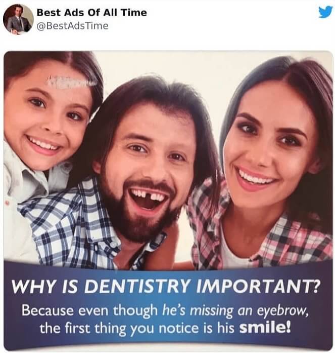
Hence, giving you a clear example of why it's important to go to the dentist. In any other image, a shaved eyebrow would stand out like a sore thumb.
Bic's Shaved Grass Advertisement
Hence, giving you a clear example of why it's important to go to the dentist. In any other image, a shaved eyebrow would stand out like a sore thumb.
Bic's Shaved Grass Advertisement
Advertisements don't have to be confined to commercials or billboards. Sometimes they can take the form of giant outside installations, as with this Bic ad from 2008. It shows a giant razor resting on a board. In front of it is a line of freshly mowed grass that makes it look as if the razor cleanly cut the grass. Obviously, it's meant to reflect how their razors can cleanly shave a face or another area of the body.
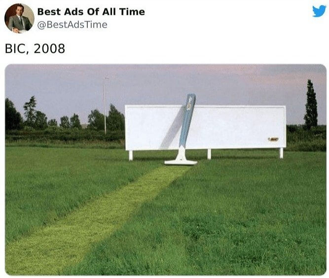
While advertisements like this might not gain a lot of initial exposure, they do have the potential to gain notoriety online or through T.V. if a news broadcast picks it up.
Ashton Martin's Prenup Claim
While advertisements like this might not gain a lot of initial exposure, they do have the potential to gain notoriety online or through T.V. if a news broadcast picks it up.
Ashton Martin's Prenup Claim
Car ads are usually filled with all sorts of claims that end with something like this: "... than any other car." However, this ad from Ashton Martin turns that same tired line on its head. Released in 2018, the company created this graphic design with the claim that their cars are included in more prenups than any other car out there. We can't actually confirm this, but it would make a bit of sense.
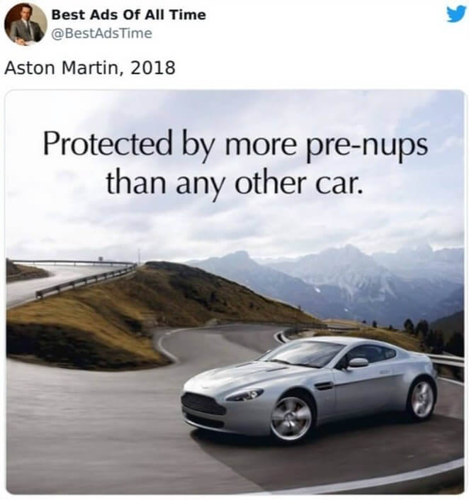
Ashton Martin's cars are gorgeous, and they come with a price tag to match, so it would make sense that any potential husband or wife would want to protect their favorite car.
Porsche's 'Nobody's Perfect' Ad
Ashton Martin's cars are gorgeous, and they come with a price tag to match, so it would make sense that any potential husband or wife would want to protect their favorite car.
Porsche's 'Nobody's Perfect' Ad
This might just be one of our favorite ads on this list. In 1983, Porsche released this advertisement with the results of the venerable 1983 Le Mans race. Porsche cars placed in all but one of the top 10 spots, which is honestly pretty amazing. The tagline "Nobody's Perfect" is also really clever. The whole ad only comprises a few lines worth of text, but if it doesn't make you want to go out and buy a Porsche, then nothing will.
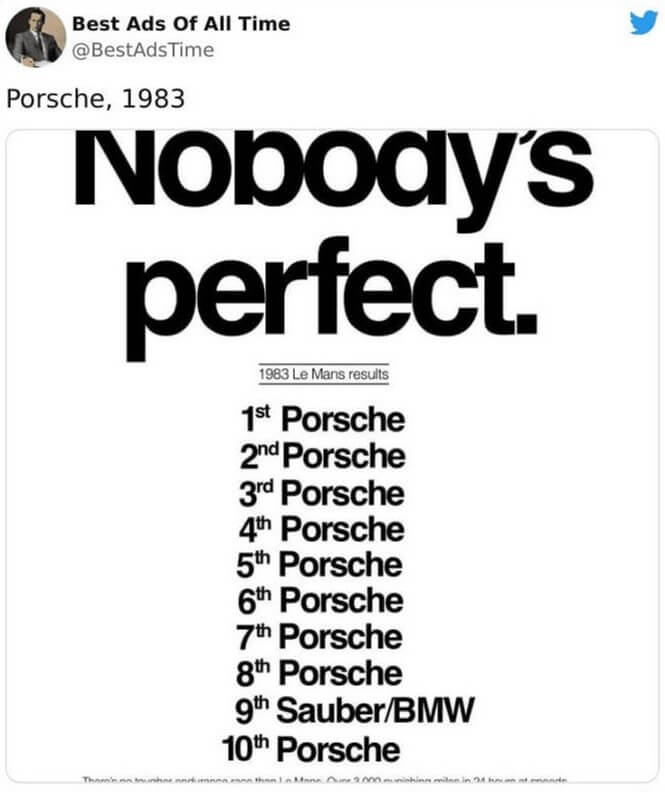
Over the years, Le Mans has provided many a marketing team with ad-worthy material, but this might just be one of the best related to the race that we've seen.
Kit Kat's Viral 2021 Ad
Over the years, Le Mans has provided many a marketing team with ad-worthy material, but this might just be one of the best related to the race that we've seen.
Kit Kat's Viral 2021 Ad
This ad actually started off as unofficial, but it soon went viral, and after the company saw it, they asked if they could use it on their own social media accounts. It was released by a designer named Sam Henning and it perfectly captures 2021. This was when nearly everyone that could, worked from home and had to deal with constant meetings and Zoom calls with fellow colleagues from work.
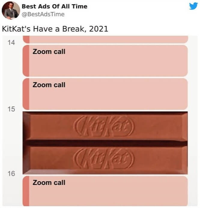
It also works pretty well with Kit Kat's traditional marketing material, which usually always involves taking a break from something to go and snack on a Kit Kat bar.
FedEx's Dig At Competitor, DHL
It also works pretty well with Kit Kat's traditional marketing material, which usually always involves taking a break from something to go and snack on a Kit Kat bar.
FedEx's Dig At Competitor, DHL
It's not uncommon for companies to directly reference their competitors in their ads, but it usually does make for some entertaining material. This ad by FedEx was released in 2017, and it shows one of their trucks beating a DHL truck to a delivery. The second truck is painted on the side of the FedEx vehicle, but it's a really clever way of telling customers that they're quicker than their competitors.
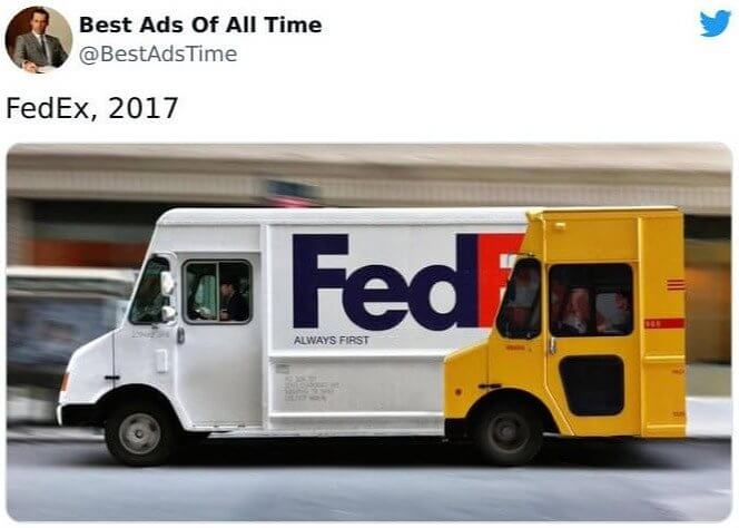
If you look closely at the truck in front, it also has the words "Always First" written on the side, which helps send a clear message to both customers and DHL.
Daihatsu's Hijet Print Advertisement
If you look closely at the truck in front, it also has the words "Always First" written on the side, which helps send a clear message to both customers and DHL.
Daihatsu's Hijet Print Advertisement
The stereotype goes that vans aren't really that cool. However, this ad by Daihatsu makes a pretty strong case for buying into their Hijet van. The van, the company argues, has plenty of space for picking up women. It actually has around five times more space for women than a Lamborghini, or so the ad goes. It's pretty clever marketing copy, and it plays to one of the van's main strengths.
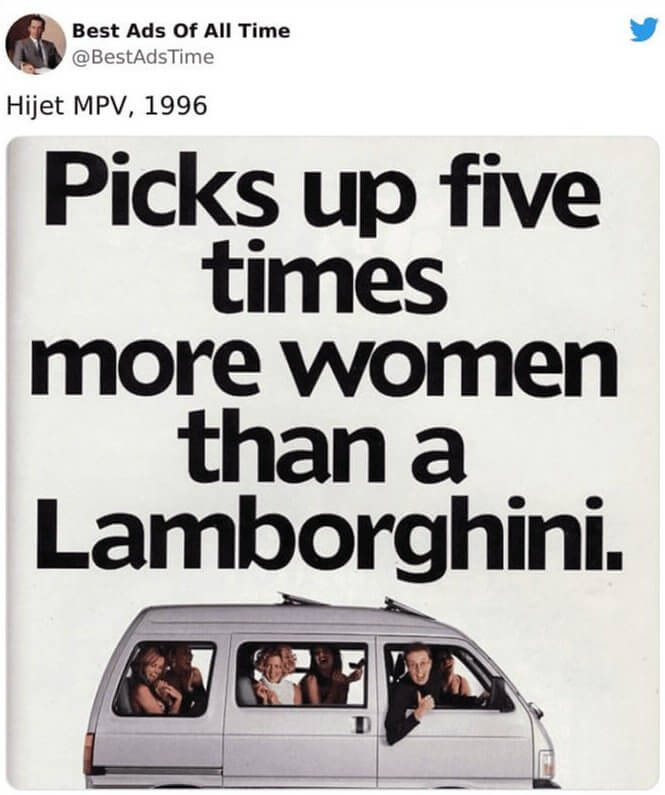
It also costs much less than a Lamborghini, but that's neither here nor there. It's really all about the interior space, which could be used to carry around just about anything.
Volvo's Legendary Jean Claude Van Damme Commercial
It also costs much less than a Lamborghini, but that's neither here nor there. It's really all about the interior space, which could be used to carry around just about anything.
Volvo's Legendary Jean Claude Van Damme Commercial
No, this shot isn't staged; that really is Jean Claude Van Damme doing a split while balancing between two very large Volvo semis. The commercial was released in 2013, and as you might imagine, it turned a few heads when people first saw it. However, it was very much a real stunt that they performed and shot, and Van Damme even managed to do it in a single take.
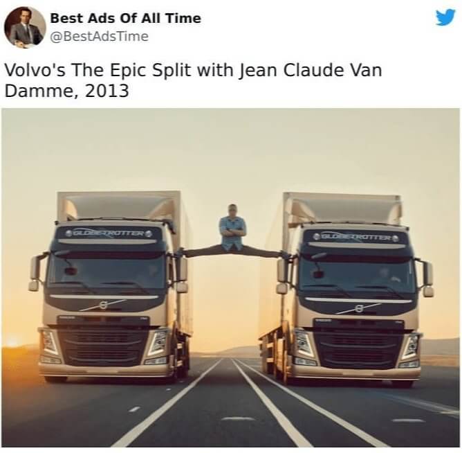
The commercial was meant to showcase Volvo's new steering system and how stable and precise it was. Oh, and both trucks were going in reverse with trailers attached to them.
Axe's Iconic Campaign Ads
The commercial was meant to showcase Volvo's new steering system and how stable and precise it was. Oh, and both trucks were going in reverse with trailers attached to them.
Axe's Iconic Campaign Ads
If you're in marketing, then you already know that it helps to know your customer. Fragrance company Axe certainly knew theirs, and it led them to create one of the most iconic marketing campaigns of all time. Pretty much every Axe commercial or ad resembled these signs, and they showed a man putting on Axe deodorant and then getting swarmed by groups of women. Hence, these emergency exit signs that were made by Axe.
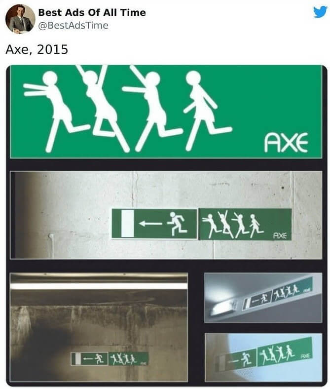
And while nobody really believes that putting on Axe spray is going to cause them to have to run for their lives, these ads were still incredibly hilarious, and they created quite a lot of buzz.
Pepsi's 'We Wish You A Scary Halloween'
And while nobody really believes that putting on Axe spray is going to cause them to have to run for their lives, these ads were still incredibly hilarious, and they created quite a lot of buzz.
Pepsi's 'We Wish You A Scary Halloween'
The rivalry between Pepsi and Coca-Cola is truly one for the ages. Over the years, Pepsi has poked and prodded its rival in commercial after commercial, but this might just be one of the best. It's an advertisement that appeared around Halloween time and it shows a Pepsi can wearing a costume to look like a Coca-Cola. It doesn't matter which drink is your favorite, you have to admit that this is pretty funny.
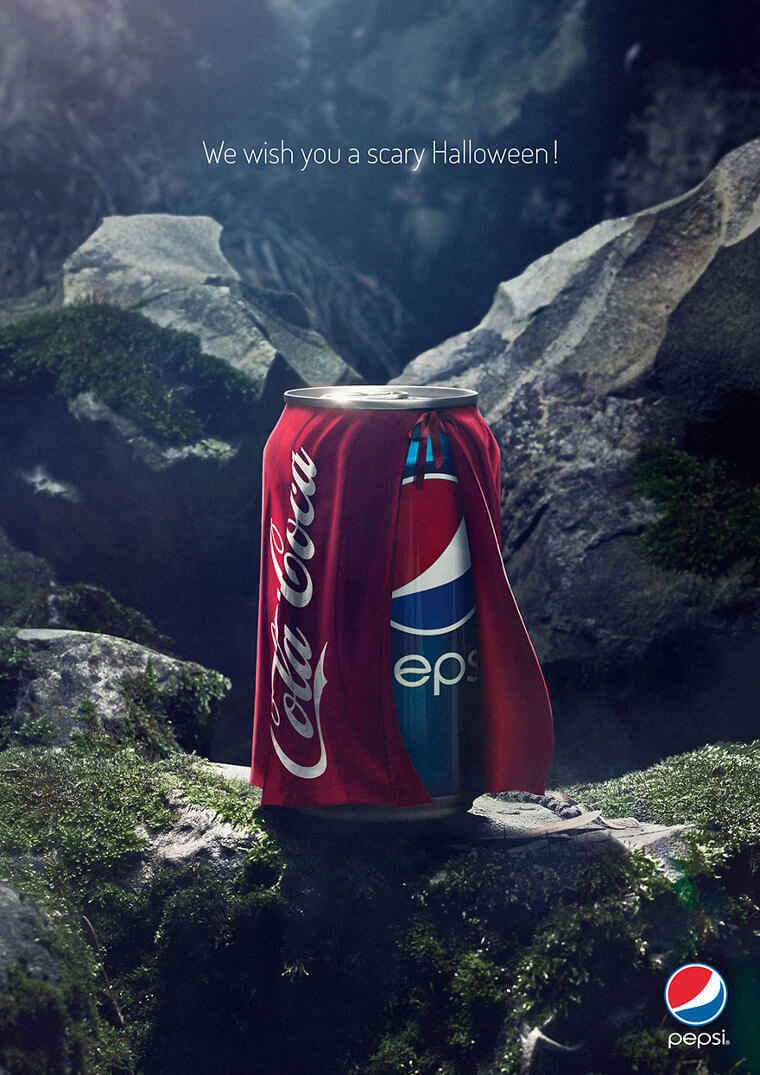
This ad was so popular that Coke fans responded with a viral ad of their own by changing the text to say, "Everybody wants to be a hero!"
McDonalds Pedestrian Crosswalks In Zurich
This ad was so popular that Coke fans responded with a viral ad of their own by changing the text to say, "Everybody wants to be a hero!"
McDonalds Pedestrian Crosswalks In Zurich
Advertisements can come in many shapes and forms. Just take a look at these Mcdonald's fries that were painted as crosswalks in Zurich, Germany. The city holds a giant festival every three years called Züri Fäscht, which sees food vendors turn out to cater to all of the pedestrians. So, someone at Mcdonald's decided that they'd paint these crosswalks next to their locations in order to better stand out and tempt passersby.
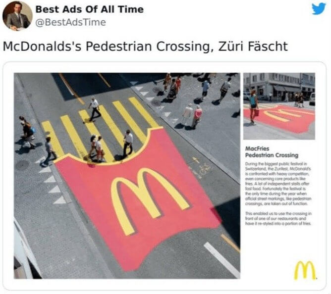
We're not entirely sure if it worked or not, but we are pretty sure that it didn't hurt. It also made for a really memorable advertisement that's still in people's minds today.
Tabasco Sauce Ad Images
We're not entirely sure if it worked or not, but we are pretty sure that it didn't hurt. It also made for a really memorable advertisement that's still in people's minds today.
Tabasco Sauce Ad Images
There are some brands out there that don't really need to advertise. They're so popular that they're pretty much household names by now. And while Tabasco is certainly one of those products, that hasn't stopped the company from releasing iconic ads over the years. This set of graphic designs is pretty great, and they reimagine the hot sauce as different fire-related items, from a grenade to a fire extinguisher to a bottle of Tabasco.
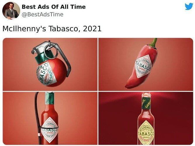
We're sure that everyone has their own personal favorite, but we especially enjoy the image of the pepper, which actually also resembles a Tabasco bottle in shape.
Hot Wheel's 'Curl' Advertisement
We're sure that everyone has their own personal favorite, but we especially enjoy the image of the pepper, which actually also resembles a Tabasco bottle in shape.
Hot Wheel's 'Curl' Advertisement
Here's another installation that turned a few heads when it was first put up. This one is from the toy maker Hot Wheels. The company put up a giant loop sign on the side of a bridge to make it look like a loop you might see in a Hot Wheels racetrack. It's even got a little Hot Wheels logo right next to the loop. The whole thing is pretty charming.
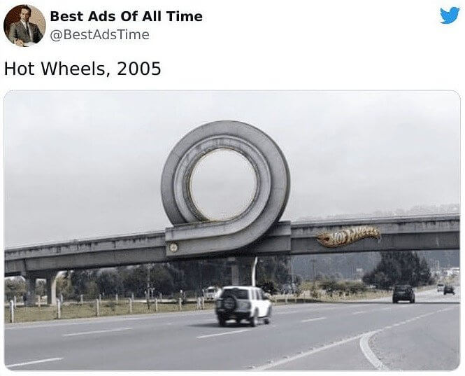
If you've ever played with Hot Wheels as a child, then we'd imagine seeing this while going down the road might bring back some memories. It's also just a really cool installation.
Apple's Paper Thin Mac Print Ad
If you've ever played with Hot Wheels as a child, then we'd imagine seeing this while going down the road might bring back some memories. It's also just a really cool installation.
Apple's Paper Thin Mac Print Ad
Titled "Ultra Thin Mac," Apple's 2007 print advertisement was meant to show off just how thin their new laptop was. (This was in an era before really thin laptops were a thing). The company has had some really memorable ads over the years, and this one is no exception. It's well thought out and cleverly executed since what's really thinner than a sheet of paper? Maybe only Apple's new laptop, that's what.
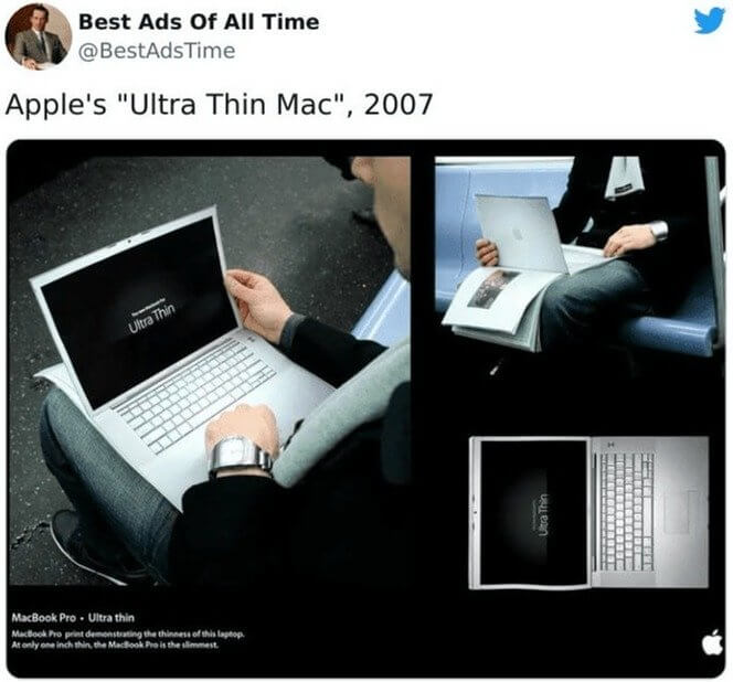
Of course, the laptop wasn't quite as thin as the paper used in this graphic design, but it was still an excellent way to get the company's point across, especially before ultra-thin laptops were common.
MGB's 'Your Mother Wouldn't Like It' Ad
Of course, the laptop wasn't quite as thin as the paper used in this graphic design, but it was still an excellent way to get the company's point across, especially before ultra-thin laptops were common.
MGB's 'Your Mother Wouldn't Like It' Ad
This ad is pretty self-explanatory, but we'll go over it anyway. The ad by MGB was released in 1970, and it shows two teenagers out in the woods hanging out by their bright orange sports car. Presumably, it's meant to convey a sense of cool as whatever the teens are up to; their mothers probably wouldn't approve. This was also during a time of cultural revolution and a changing or norms.
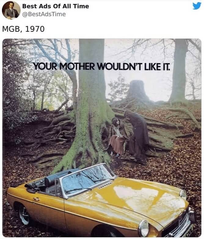
It's a pretty cool advertisement that's both a product of its time and also kind of relevant even today. It wouldn't be surprising to see an ad today with the same line used.
McDonald's 2021 Father's Day Ad
It's a pretty cool advertisement that's both a product of its time and also kind of relevant even today. It wouldn't be surprising to see an ad today with the same line used.
McDonald's 2021 Father's Day Ad
Fathers have a pretty hard time of it. They're often stressed out, overworked, and losing their hair. That might be why McDonald's decided to release this image in 2021, celebrating Father's Day by showing a bun that looks surprisingly similar to a balding man's head. Instead of covering the entire head, the sesame seeds on the bun are spread around the outer edges, just like the hair on a balding head.
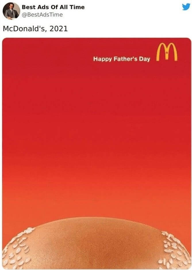
It's a pretty clever design, and we're sure that it received a few laughs (and sighs) from more than a couple of dads out there when they saw it.
Allstate 2021 Garage Installation
It's a pretty clever design, and we're sure that it received a few laughs (and sighs) from more than a couple of dads out there when they saw it.
Allstate 2021 Garage Installation
When you think of an Allstate marketing campaign, odds are you think of their long-running "Mayhem" ads. And while those ads have definitely delivered a couple of memorable commercials over the years, this installation is set in the real world. The company, somehow, placed a car halfway off the edge of the giant garage, with a billboard underneath asking if people out there thought they were in good hands.
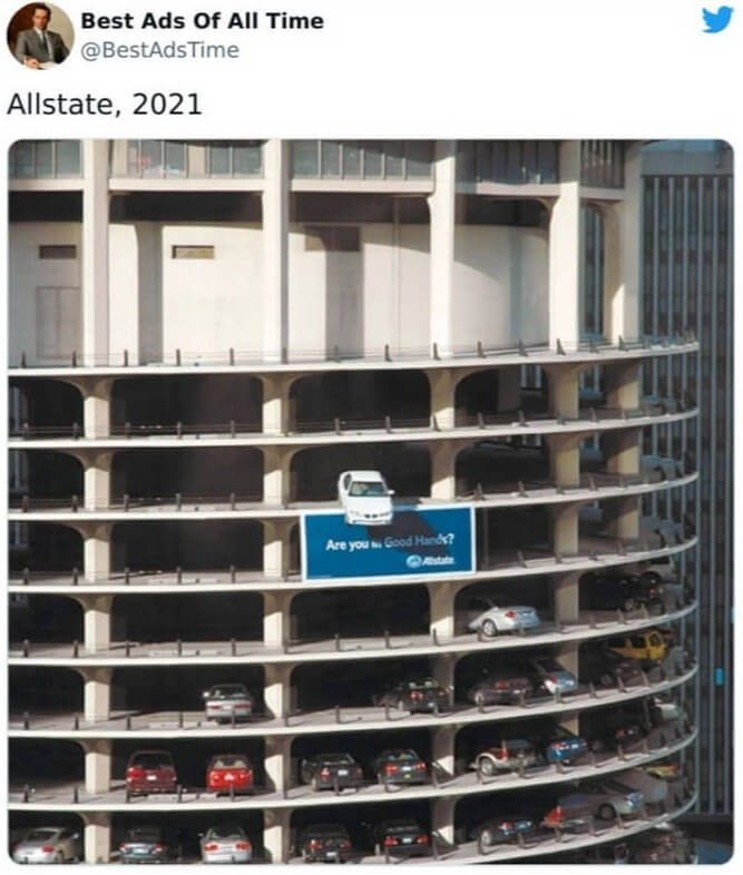
This is one of those ads that force you to look up and pay attention. We couldn't imagine walking down the street and then suddenly seeing a car dangling off a garage.
Porsche's Screaming Passenger Ad
This is one of those ads that force you to look up and pay attention. We couldn't imagine walking down the street and then suddenly seeing a car dangling off a garage.
Porsche's Screaming Passenger Ad
There's one thing that most car ads on this list have in common. They all get why their customers buy their vehicles. This graphic design by Porsche shows that they know their customers buy their cars because they want performance; they want to go fast. And sometimes, when you're going fast, you have a passenger in the car that isn't as appreciative of your car's performance as you are.
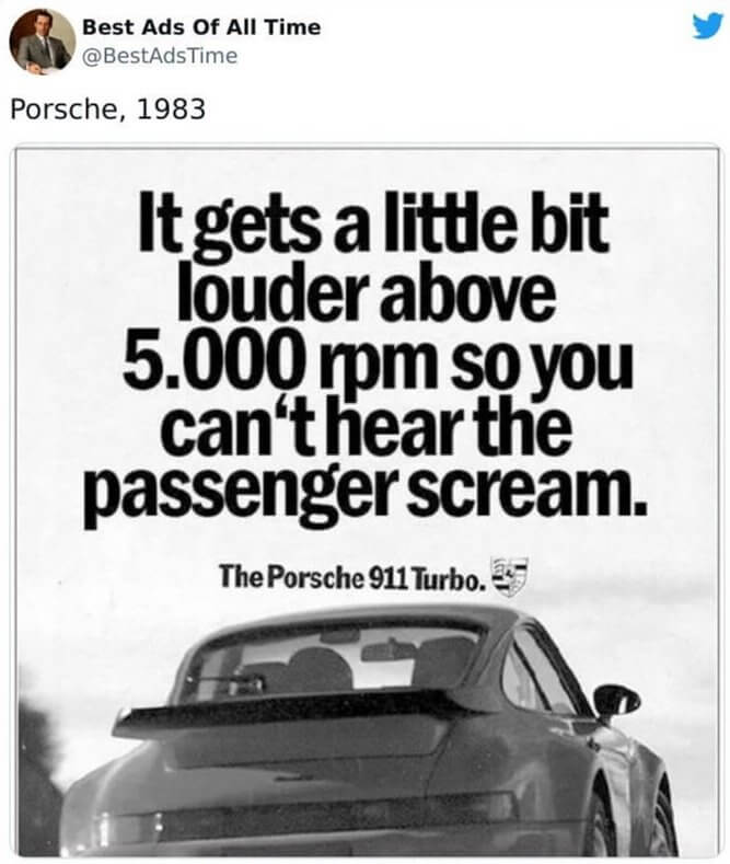
That's why Porsche's cars get louder after you get above 5,000 RPM, or so the ad says. It's just a funny little nod to consumers that this car company is made up of people who enjoy driving and going fast just as much as their customers.
San Diego Zoo's Giraffe Advertisement
That's why Porsche's cars get louder after you get above 5,000 RPM, or so the ad says. It's just a funny little nod to consumers that this car company is made up of people who enjoy driving and going fast just as much as their customers.
San Diego Zoo's Giraffe Advertisement
When you think of clever ads, you don't always think of places like zoos. However, maybe you should because this advertisement from the San Diego Zoo is as clever as any of the others on this list. They added what appears to be a fabric or something to a light pole, turning it into the neck of a giraffe. The neck pattern leads all the way up to their sign at the top of the pole.
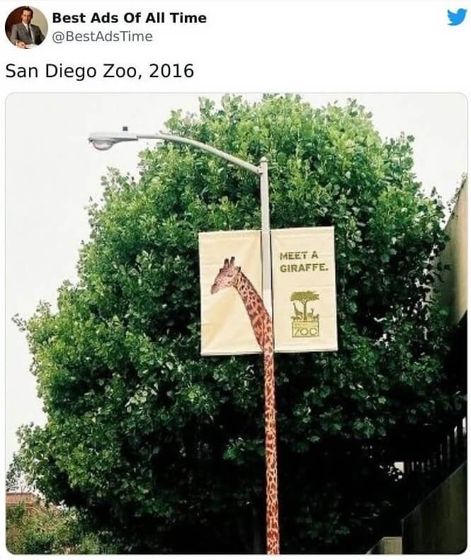
If there was just a sign at the top of the pole, then people would be much less likely to turn their heads and look up. But when there's a strange pattern snaking all the way up a light pole, people can't help but pay attention, which is great marketing.
This McDonald's Billboard From 2020
If there was just a sign at the top of the pole, then people would be much less likely to turn their heads and look up. But when there's a strange pattern snaking all the way up a light pole, people can't help but pay attention, which is great marketing.
This McDonald's Billboard From 2020
Billboard marketing has been around forever, but that doesn't mean that there still aren't ways to innovate. McDonald's added the temperature to this billboard, reminding people that they could swing by one of their locations to grab an ice-cold drink when things got too hot outside. And from the reading on this board, it does look like things were getting pretty warm wherever this was located. It's a pretty clever use of a billboard.
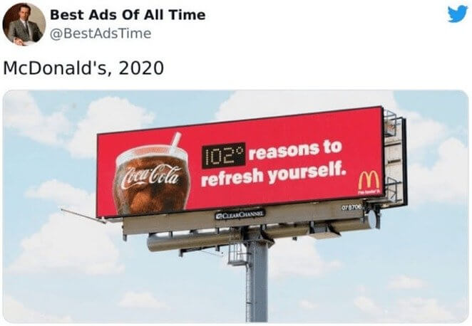
Then again, McDonald's is one of those few companies that always seems to have great marketing material. We can't remember a time when they didn't have good commercials or clever signs.
Austin Morris's Mini Print Advertisement
Then again, McDonald's is one of those few companies that always seems to have great marketing material. We can't remember a time when they didn't have good commercials or clever signs.
Austin Morris's Mini Print Advertisement
When it comes to vehicles, you have to play to your strengths if you're a company. That's what Austin Morris did with this ad about their mini from 1979. It's just a clever tongue-in-cheek line about not needing a large vehicle to be happy. However, it's humorous, and it actually gets people thinking about the brand and maybe even considering buying a smaller vehicle. So, we'd say that it totally works.
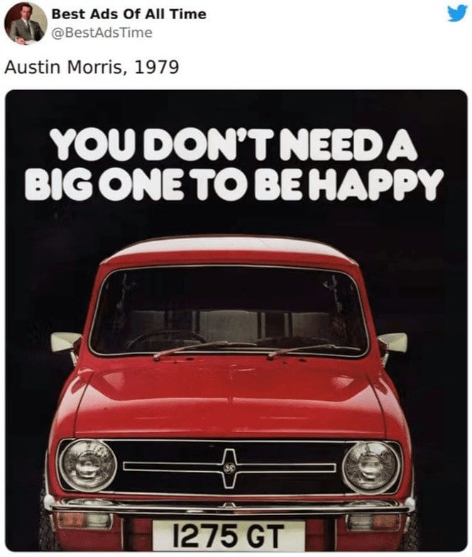
It also plays to the car's strength, which is compact affordability: If it costs less and still gets you to where you need to go, then why not go for a mini?
Ajax Wipes 'Cereal, Juice' Ads
It also plays to the car's strength, which is compact affordability: If it costs less and still gets you to where you need to go, then why not go for a mini?
Ajax Wipes 'Cereal, Juice' Ads
Often, an ad doesn't even need text to stand out and be great. If something can be demonstrated clearly and cleverly through images or graphic design alone, then all the better. This image from Ajax Wipes's 2012 "Cereal, Juice" ads shows spilled juice with a missing portion in the middle. The company is saying that its wipes are so fast and efficient that they can wipe away juice before it even touches the floor.
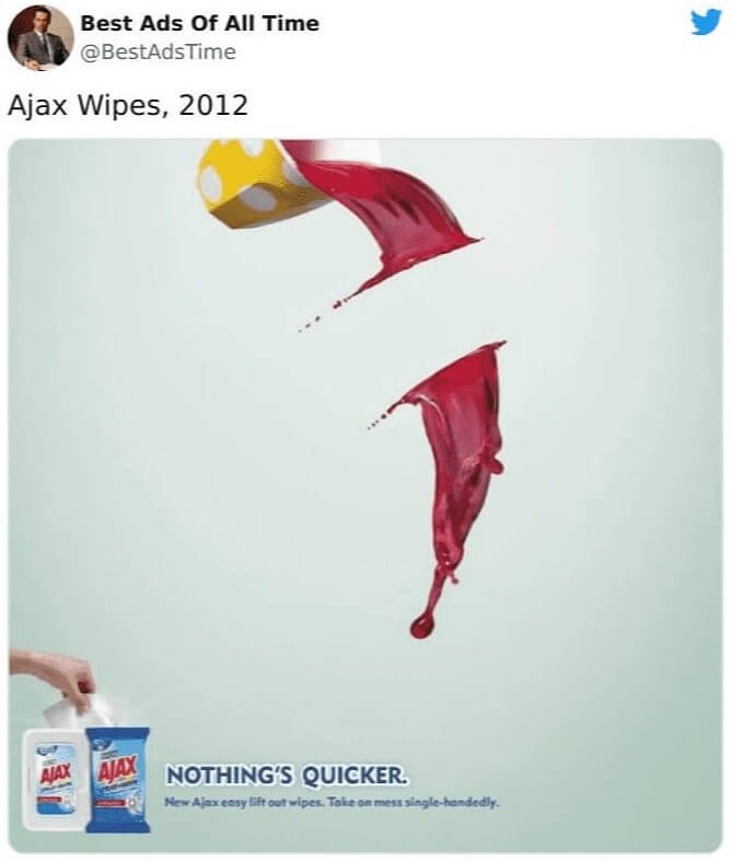
There are plenty of clever ads on this list, but this one is probably one of the simplest or most minimalistic, while also being smart and easy to understand.
Chupa Chups Sugar Free Ad
There are plenty of clever ads on this list, but this one is probably one of the simplest or most minimalistic, while also being smart and easy to understand.
Chupa Chups Sugar Free Ad
Here is another simple yet highly effective ad from candymaker Chupa Chups. It's meant to show that their candy, unlike most other brands out there, doesn't contain any sugar, which is why the ants in this image are completely avoiding the lollipop. Normally, they'd be swarming everywhere trying to bite off a piece and take it back to their mound, but not here. Images like this are great advertisements.
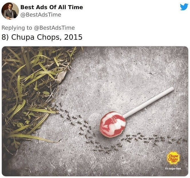
Not only does it perfectly represent your product, but it's also just interesting to look at since there's actually something going on here. The image sort of tells a small story.
WMF's Gourmet Knife Image
Not only does it perfectly represent your product, but it's also just interesting to look at since there's actually something going on here. The image sort of tells a small story.
WMF's Gourmet Knife Image
Is this image of a carrot and cutting board chopped into strips a bit of hyperbole? Sure. But is it also a bit of fun? You bet. This graphic design was created to showcase how sharp WMF's Gourmet Knife was, and it shows that pretty well. Nobody actually thinks that the knife can cut through a wooden board like butter, but it's still an entertaining little way of saying your knives are really sharp.
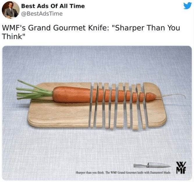
It's also kind of relatable, as we're sure many out there have thought about how sharp a knife would have to be to cut through a cutting board while chopping vegetables.
Orion's 2005 Telescope Ad
It's also kind of relatable, as we're sure many out there have thought about how sharp a knife would have to be to cut through a cutting board while chopping vegetables.
Orion's 2005 Telescope Ad
We don't know why any telescope company would actually need to advertise since telescopes are pretty awesome all on their own. However, we're glad that telescope maker Orion released this gem way back in 2005. It shows images of the moon as seen through different magnifications. These aren't what you'd actually see, and instead, it's a bit exaggerated, but it's still a fun way of drawing attention to you and your product.
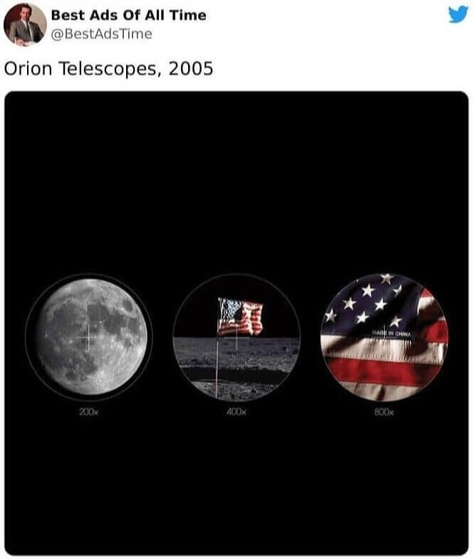
Needless to say, some took this ad a little too seriously when it was first released. However, we hope that doesn't dissuade the company from coming up with clever ads in the future.
Volkswagen's Park Assist Image
Needless to say, some took this ad a little too seriously when it was first released. However, we hope that doesn't dissuade the company from coming up with clever ads in the future.
Volkswagen's Park Assist Image
This ad basically just consists of an image, and that's all it really needs to be effective. It's an ad about Volkswagen's park assist, and it shows a hedgehog between a couple of bags of goldfish. Basically, the advertisement is saying that the company's park assist is just as accurate as this hedgehog, which is pretty dang precise if you ask us. We just hope no goldfish were harmed in the making of this image.
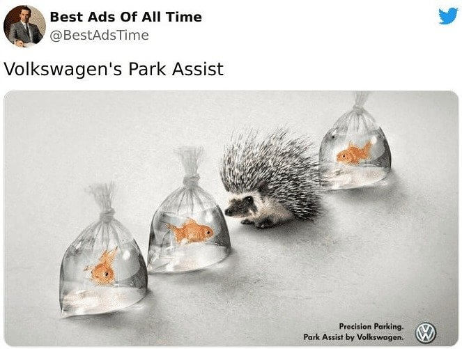
This ad is also pretty random, so whoever thought it up must have a pretty unique marketing mind. Who would think to place a hedgehog between bags of goldfish?
BMW's DC Comics Collaboration
This ad is also pretty random, so whoever thought it up must have a pretty unique marketing mind. Who would think to place a hedgehog between bags of goldfish?
BMW's DC Comics Collaboration
It's not uncommon to see companies use celebrities in their advertisements. For whatever reason, people just trust a product more if they see a celebrity using it. However, what about fictional comic book characters? Well, that's what BMW used in this ad for its M3 series of vehicles. You can see the Flash's arms on the car's steering wheel along with the words "A vehicle created for real speed experts."
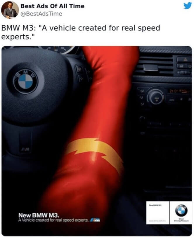
Why would the Flash, who is faster than pretty much anything else in his comic book universe, need to drive a car? We don't know, but we like the collaboration.
Koleston's Changing Billboard
Why would the Flash, who is faster than pretty much anything else in his comic book universe, need to drive a car? We don't know, but we like the collaboration.
Koleston's Changing Billboard
This billboard was created by the hair care brand Koleston in 2008. It just seems like a normal sign with the company's name at the bottom, but it's actually a bit cleverer than that. The hair portion of the ad is cut out, allowing it to change colors as the sun sets. At night, the color of the hair appears dark brown or black. It's pretty genius from a marketing standpoint.
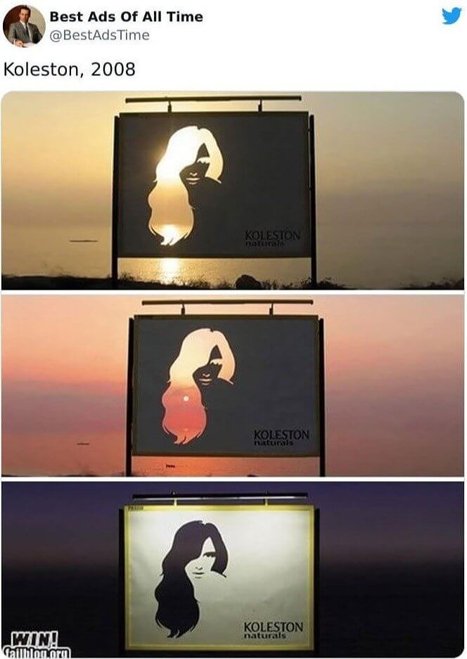
Something like this also makes for good material online. We mean, this ad is from 2008, and the image is still being shared some 14 years later.
McDonald's Sundial Billboard
Something like this also makes for good material online. We mean, this ad is from 2008, and the image is still being shared some 14 years later.
McDonald's Sundial Billboard
Just when we thought that there wasn't a way to innovate on the tried and true billboard, here comes McDonald's to add a twist. They turned this entire billboard into a sundial, where the shadow rests on a different menu item every hour of the morning. It's not only clever, but it's also pretty technically impressive. Who did they consult to make sure that the shadow would be exactly where they wanted it?
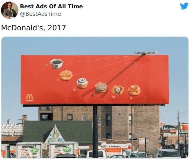
We're also really curious about where they placed this billboard, as they undoubtedly would've had to change things around depending on if they placed others in different countries or regions.
Kit Kat's Stress Reducing 2013 Advertisement
We're also really curious about where they placed this billboard, as they undoubtedly would've had to change things around depending on if they placed others in different countries or regions.
Kit Kat's Stress Reducing 2013 Advertisement
Sometimes, it's best if your marketing is relatable. Usually, when we're stressed at work, we turn to something like a stress ball. However, after seeing this image of a couple of broken Kit Kats, we might be turning to the chocolatey treat in the future. Each portion of the bar contains a different workplace annoyance, which is presumably why all of the different portions of the bar are broken in half. We'll admit that it's better than breaking a pencil.
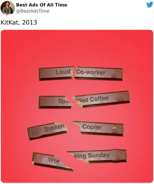
Not only do you get the same satisfying crack, but you also get to eat a Kit Kat after you break it, which sounds like a win-win. It might also keep someone from losing it at work and having to take a trip to HR.
Ford's Key To The City
Not only do you get the same satisfying crack, but you also get to eat a Kit Kat after you break it, which sounds like a win-win. It might also keep someone from losing it at work and having to take a trip to HR.
Ford's Key To The City
When you're a car company as old as Ford, you're bound to have a couple of timeless ads under your belt. This ad appeared in 2008, during the middle of the Great Recession and a crisis in the U.S. auto industry, no less. Still, it's an understated ad about how driving a Ford Fusion is like having a key to the city. We just wish that we could tell what city from the teeth on the key.
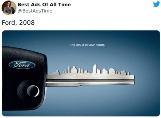
However, maybe it's supposed to look like it could be anywhere. It's a surprisingly forward-looking commercial from a company that's probably best known for its pickup trucks.
Stihl's Bad News Advertisement
However, maybe it's supposed to look like it could be anywhere. It's a surprisingly forward-looking commercial from a company that's probably best known for its pickup trucks.
Stihl's Bad News Advertisement
Here's a pretty clever little print advertisement. Stihl makes some of the best yard equipment out there, and apparently, they also make some great graphic designs, too. This one shows a Stihl leaf blower getting rid of some bad news or a page of words that contain bad news. We imagine that many of the people who spend a lot of money on high-end products like Stihl also take comfort in working in their yards.
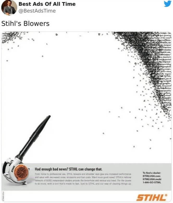
So, we think the ad is basically saying to take a break from media and just relax and destress by going out and doing some yard work, which is pretty clever.
Nike's Run Ad From 2018
So, we think the ad is basically saying to take a break from media and just relax and destress by going out and doing some yard work, which is pretty clever.
Nike's Run Ad From 2018
Nike is another company that seems to be a leader in its field when it comes to marketing. They've had some really inspiring campaigns in the past, but this one from 2018 is the one we chose for this list. You can see two benches in this image. The second one contains Nike's logo with the word "run." However, the bench lacks a seat. The ad is basically urging people to skip the breather and just get out there and run.
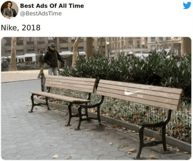
However, we could totally see someone who's just finished running coming up and getting aggravated that the seat on the bench is missing. That might be why they made sure there was a perfectly good bench right next to it.
MA's 'Discover The Full Story' Ad
However, we could totally see someone who's just finished running coming up and getting aggravated that the seat on the bench is missing. That might be why they made sure there was a perfectly good bench right next to it.
MA's 'Discover The Full Story' Ad
Leave it to a museum to really come up with a thought-provoking graphic design like this. The Shusev State Museum of Architecture released the images here, and they show how famous buildings are really only the tip of the iceberg. The architecture that inspired and led to these buildings runs much deeper. And presumably, visitors can discover all of this at the museum, which is a really clever way of enticing people.
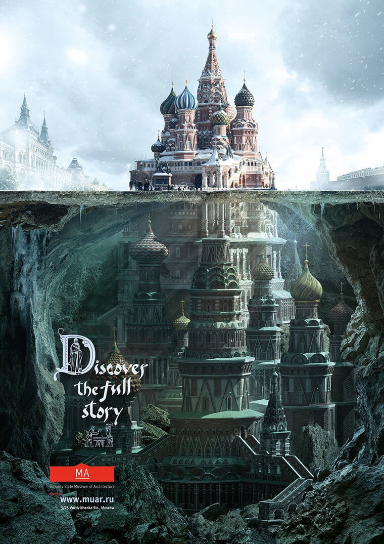
Not only that, but the images themselves are also really beautiful and well done, which doesn't hurt. In fact, it kind of makes us want to visit an architecture museum now.
Not only that, but the images themselves are also really beautiful and well done, which doesn't hurt. In fact, it kind of makes us want to visit an architecture museum now.


Post a Comment